A Histogram is a pictorial representation that shows the frequency distribution of numerical data.
Histogram displays the data in bar where each bar indicates the frequency (called a “count”) of data points or measurements that fall within a specific interval or range (called a “bin”).
It is created by grouping the measurements into “cells” or “class ” or “bins”.
Histogram is similar to the bar chart, but it groups data points into classes and plot frequencies. Bar chart is used for categorical data, but a histogram is used for quantitative (numerical) data only.
Histogram graph is considered one of the basic 7 QC Tools or Seven Basic Quality Improvement Tools and is extensively used in SPC, Lean Manufacturing, and problem-solving techniques such as 8D, PDCA, and Six Sigma.

Table of Contents
WHEN TO USE A HISTOGRAM
- To summarize large data sets graphically.
- To compare measurements to specifications.
- Assist in decision making.
PURPOSE OR BENEFITS OF HISTOGRAM
- A bar graph that shows the frequency distribution of values/data.
- To assess process capability & to understand variation.
- Useful to understand the spread or variations, and distribution in a process.
- To visualize shape of the data-normal, bimodal, skewed etc.
- To know whether a process is stable and predictable.
- To know whether the process produces within specification.
- Process monitoring and centering.
- Helps in decision-making based on the behavior of data.
- To capture process shifts and abnormalities.
HISTOGRAM IN EXCEL | HISTOGRAM WITH EXAMPLE
Steps for constructing a Frequency distribution graph or Histogram in excel are as follows:
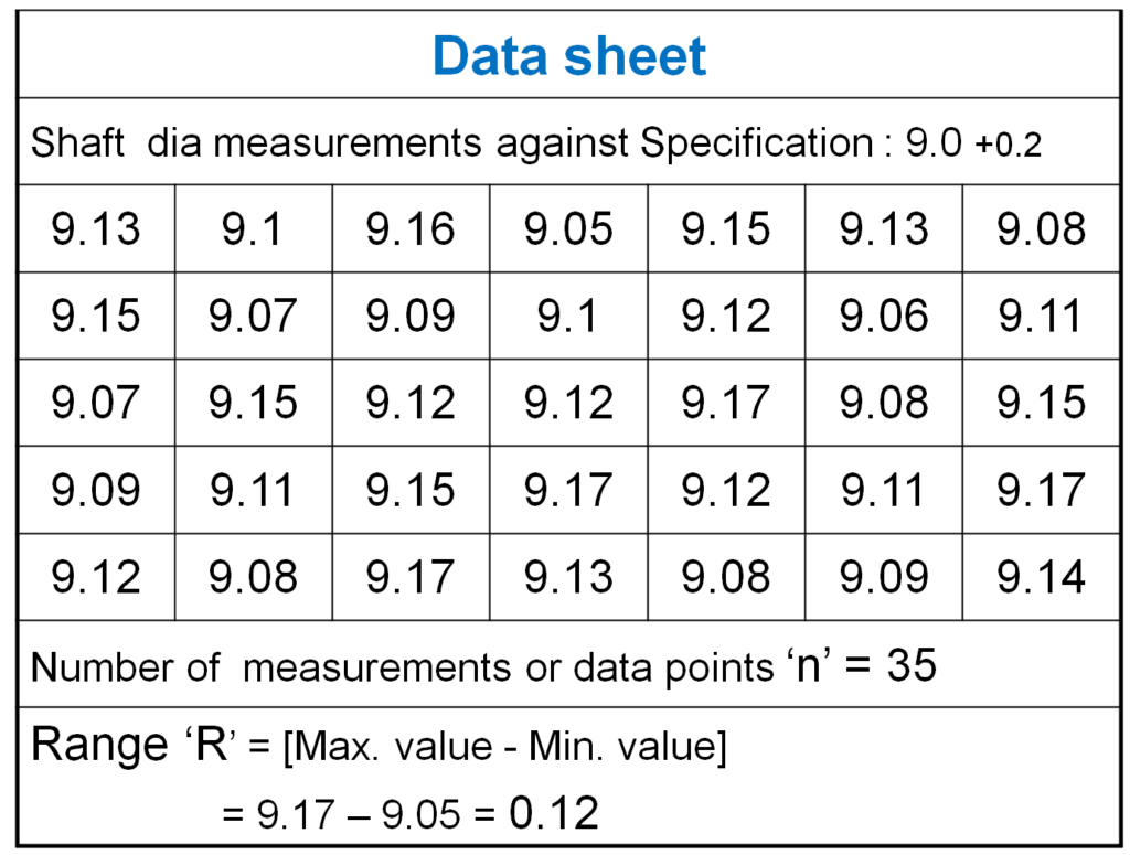
1-Count the number of data points ‘n’.
2- Compute the range of data. The range ‘R’ is the difference between the largest and the smallest value in the sample.
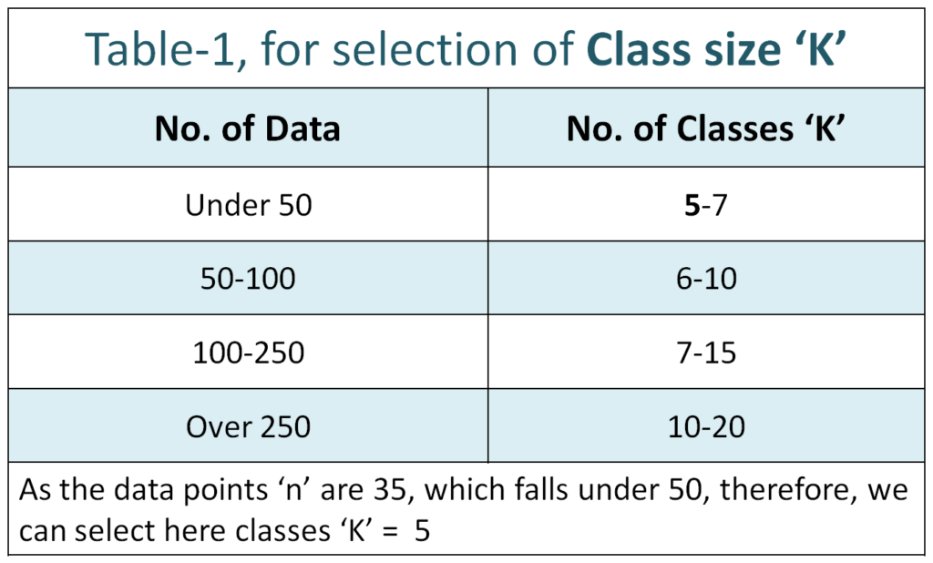
3- Determine the number of classes or intervals i.e. class size
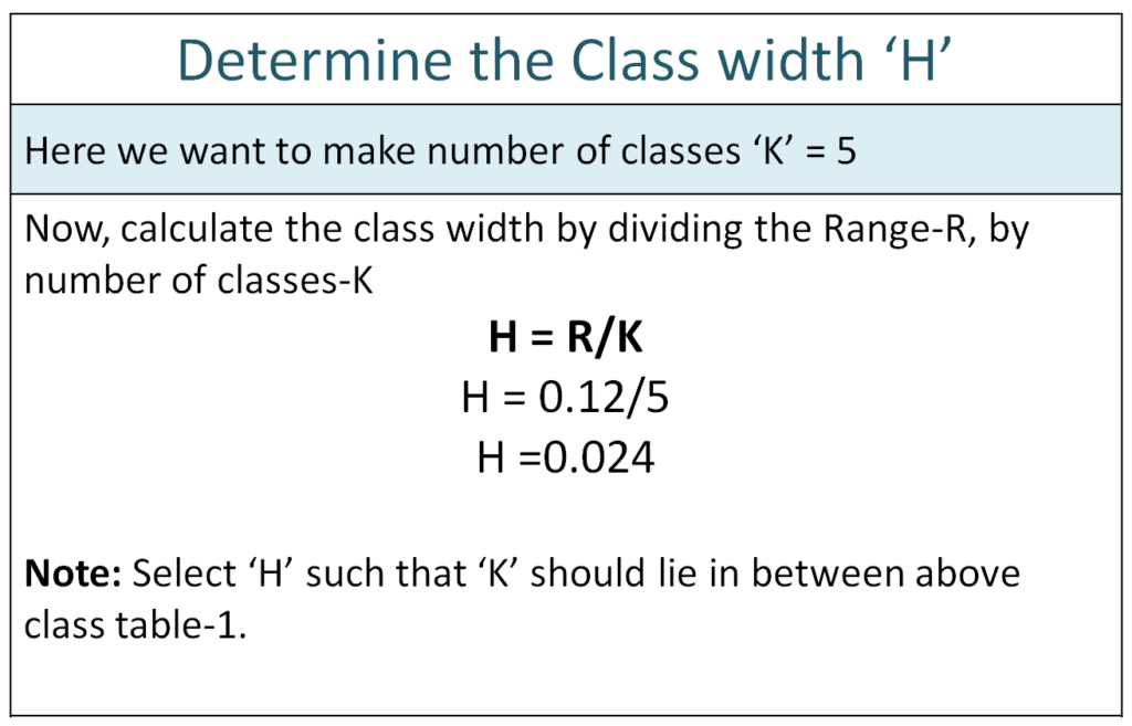
4- Compute class width.
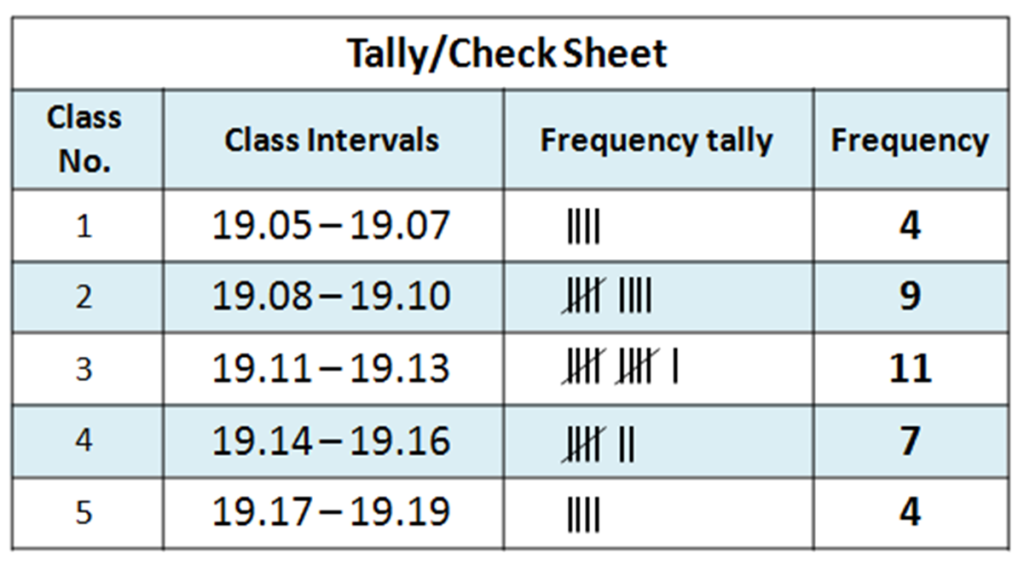
5- Prepare the Tally sheet or Check sheet by summarizing data on it.
6- Count the number of parts in each interval i.e. Number of frequencies within a particular class.
7- Now plot the graph. Place frequencies on the vertical axis, and class intervals on the horizontal axis.
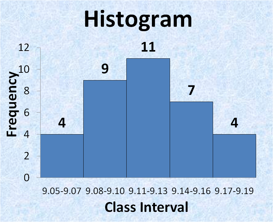
8- Interpret the histogram by seeing the shape distribution.
Histogram I Key Components
| Key Components | Description |
|---|---|
| X-axis | Represents the class intervals (bins) of data (e.g., size, weight) |
| Y-axis | Represents the frequency (how many times values fall in each bin) |
| Bars | bar height shows how many data points are in that class intervals or range |
| Bin Width | The range covered by each bar |
INTERPRETATION OF HISTOGRAM
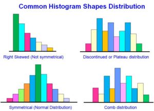
| Histogram Shapes | Interpretation |
|---|---|
| Normal (bell shape) | Indicates that the process is stable and consistent |
| Skewed Left | More values at high end, indicates that the defect at low end |
| Skewed Right | More values at low end, indicates overshooting specification |
| Bimodal | Two peaks – may suggest two machines or shifts with different performance |
| Uniform | Equal frequency – indicate possibly random process |
Download pdf copy